Our Work
ISI Athletics
ISI Athletics
ISI Athletics
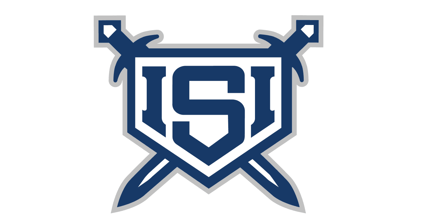
ISI Athletics came to us at the ground floor…a brand new company with a clear vision to create the premier youth baseball training facility in the region…but no visual identity to match it. The challenge was building that identity entirely from scratch in a way that could carry real weight in a competitive market.
The Approach
ISI stands for "Iron Sharpens Iron." The design process centered on developing a complete brand system that felt both aspirational and approachable, one that would inspire young athletes and their families while signaling the professionalism and seriousness of a premier training program. Every mark had to work hard across a wide range of contexts, from signage and uniforms to digital platforms and print collateral.
The Result
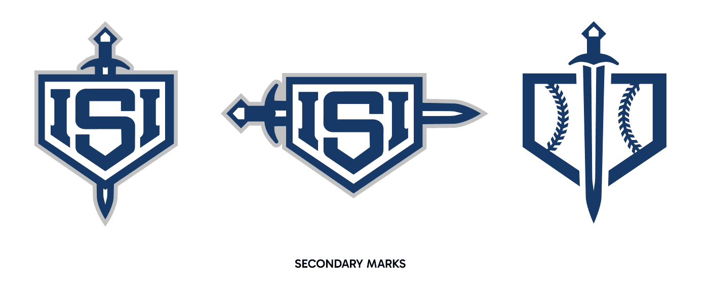
The final identity system gives ISI Athletics a comprehensive and cohesive visual language ready for launch. The full suite (primary and secondary marks, text-only wordmarks, vertical and horizontal configurations, and accompanying icons) ensures the brand shows up with consistency and confidence no matter the application. Together, the marks position ISI Athletics as a serious destination for youth baseball development in the Clarksville area, with an identity strong enough to grow alongside the facility and establish lasting recognition in the community.
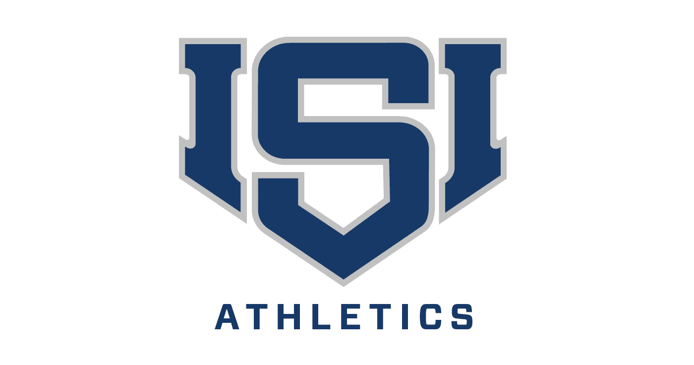
ISI Athletics came to us at the ground floor…a brand new company with a clear vision to create the premier youth baseball training facility in the region…but no visual identity to match it. The challenge was building that identity entirely from scratch in a way that could carry real weight in a competitive market.
The Approach
ISI stands for "Iron Sharpens Iron." The design process centered on developing a complete brand system that felt both aspirational and approachable, one that would inspire young athletes and their families while signaling the professionalism and seriousness of a premier training program. Every mark had to work hard across a wide range of contexts, from signage and uniforms to digital platforms and print collateral.
The Result
The final identity system gives ISI Athletics a comprehensive and cohesive visual language ready for launch. The full suite (primary and secondary marks, text-only wordmarks, vertical and horizontal configurations, and accompanying icons) ensures the brand shows up with consistency and confidence no matter the application. Together, the marks position ISI Athletics as a serious destination for youth baseball development in the Clarksville area, with an identity strong enough to grow alongside the facility and establish lasting recognition in the community.
Project Scope
Project Scope
Brand Strategy
Logo Design
Brand Strategy
Logo Design